Presentaion Mode
Adobe Illustrator
Figma
Category: UX/UI · Accessibility · Web
Collaborative project across three courses: User Experience and Interface Design, Graphical Design of User Interface, Creating Accessible Web Sites
Project Overview
This project was created as part of a multidisciplinary assignment combining three complementary courses. From a predefined list of educational topics, we chose Storytelling as the core theme. Through multiple rounds of brainstorming and refinement, we decided to focus on how artificial intelligence can enhance storytelling specifically in the context of presentation design.
A key constraint of the project was to develop a fully functional, scroll-based One-Page Website. This shaped every design decision — requiring a clear linear flow, thoughtful content hierarchy, and minimal but meaningful interactions — all in one continuous user experience.

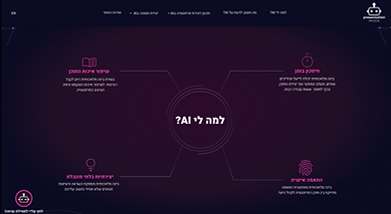
The header of our final project.
Our Challenge
Many users struggle to leverage AI effectively for presentation design. Our goal was to simplify this process while creating an inclusive, engaging experience within a one-page format.
"Let’s turn AI overwhelm into design confidence."
Target Audience
We developed four detailed personas to guide our decisions:
-
An educator looking to engage students
-
A marketing consultant with a visual impairment
-
A senior professor adjusting to digital tools
-
A design student seeking AI-powered creativity

Shira Segev
Develops study programs
"I have been developing educational programs at the university for two years. In my work at the university, I am exposed to the rapidly evolving world of artificial intelligence. Now, I am wondering how I can integrate AI into my work and use it to create content."

Danny Bar
Psychology professor and lecturer
"I've noticed a decline in my student survey ratings over the years, with feedback indicating that my presentations are not clear enough. I believe it's time to adapt my courses for a younger audience. My son recently introduced me to artificial intelligence, and I think it could be a valuable tool to help with this."
Research & Insights
We analyzed similar educational platforms and used our persona insights to inform the site's wireframes, establishing a clear structure and flow.
Structure & Flow
We designed an intentional scroll-based journey with clear visual anchors and in-page links. Our mid-to-high fidelity wireframes explored layout hierarchy while ensuring smooth transitions between sections — from onboarding through tools, examples, and tips — all without traditional page navigation.

Visual Design & Prototype
With the structure in place, we designed a visual identity that combines dark backgrounds with vibrant accents to evoke a sleek, tech-forward tone. Typography and spacing were selected for clarity across devices.
We then created an interactive Figma prototype with smooth transitions, hover effects, and a floating chatbot — all tailored to a scroll-based, single-page experience.

Accessibility Design
Accessibility wasn’t an afterthought — it was a guiding principle throughout the process.
We focused on color accessibility as a core element of our visual planning. Using the Colour Contrast Analyzer App, we tested and refined all color combinations to ensure they met WCAG 2.1 standards for visual contrast and readability.
Recognition
It was incredibly rewarding to have this project recognized beyond the classroom.
Our project was selected as the top project in the course in the category of UI Design, and was presented at the official HIT Semester Showcase.
Reflection
This project taught me more than just design skills — it shaped the way I think about users, teams, and creative constraints. I learned how much thought and intention goes into every website, and the importance of dedicating time to the design process itself.
This project helped me understand how to design holistically — combining user experience, accessibility, and aesthetics into a single flow.